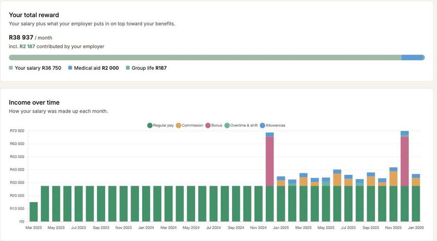
The payslip itself, laid out
The payslip opens on three figures: what you earned, what came off, and what reached your account. Underneath, every line is grouped and labelled, so a deduction is next to the other deductions rather than buried in a single long column.
Where you have allowances or reimbursements, the top figure reads Total package rather than Income, and it includes them. Total package minus deductions is your take-home, so the figures on the page reconcile.
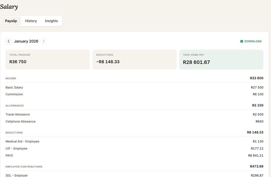
How your pay has moved
History plots your take-home and gross over every payslip we hold, and picks out what actually changed underneath it. A raise, a benefit starting or ending, a one-off payment: each one is a row you can read, with the month it happened.
Click any month, in the feed or on the chart, and the payslip for that month opens. Every payslip is reachable and bookmarkable, however far back it goes.
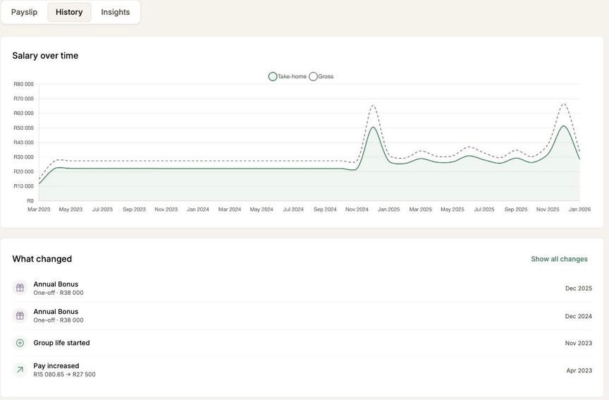
What your salary is made of
Insights turns the same numbers into four views: what makes up your salary, where it goes, how your income has been composed month to month, and your total reward.
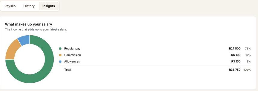
Total reward is the one worth a look. It adds what your employer contributes on top of your salary, broken out by type. Underneath, Income over time shows how each month was made up, so a commission month or a bonus stands out from the rest.